Four months into the year, and 2020 is not exactly what everyone had in mind. So far, this year has posed threats of WWIII, Australian bushfires and now the fall of the economy because of the COVID-19 pandemic.
Something that 2020 has not affected: Fonts.
Not just a bucket of fonts, but a font’s entire family that will give us hope and rise above the anxiety of financial loss and fear of the unknown as the economy slowly takes a turn for the worst. A font that will define the year as a community that will encourage everyone to come together as a team. That font will express emotions through thick and thin, while also creating a warm and reminiscent nostalgic feel of joy.
Didn’t know a font can do all of that? A font family generally has different font weights that can assist in providing a variety of expression.
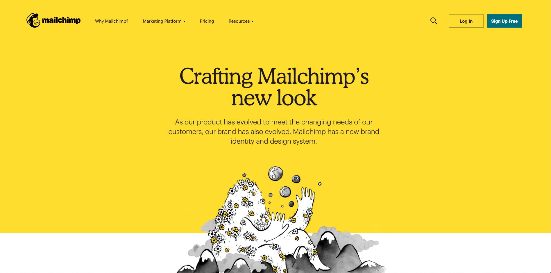
Mailchimp’s landing page for their brand release

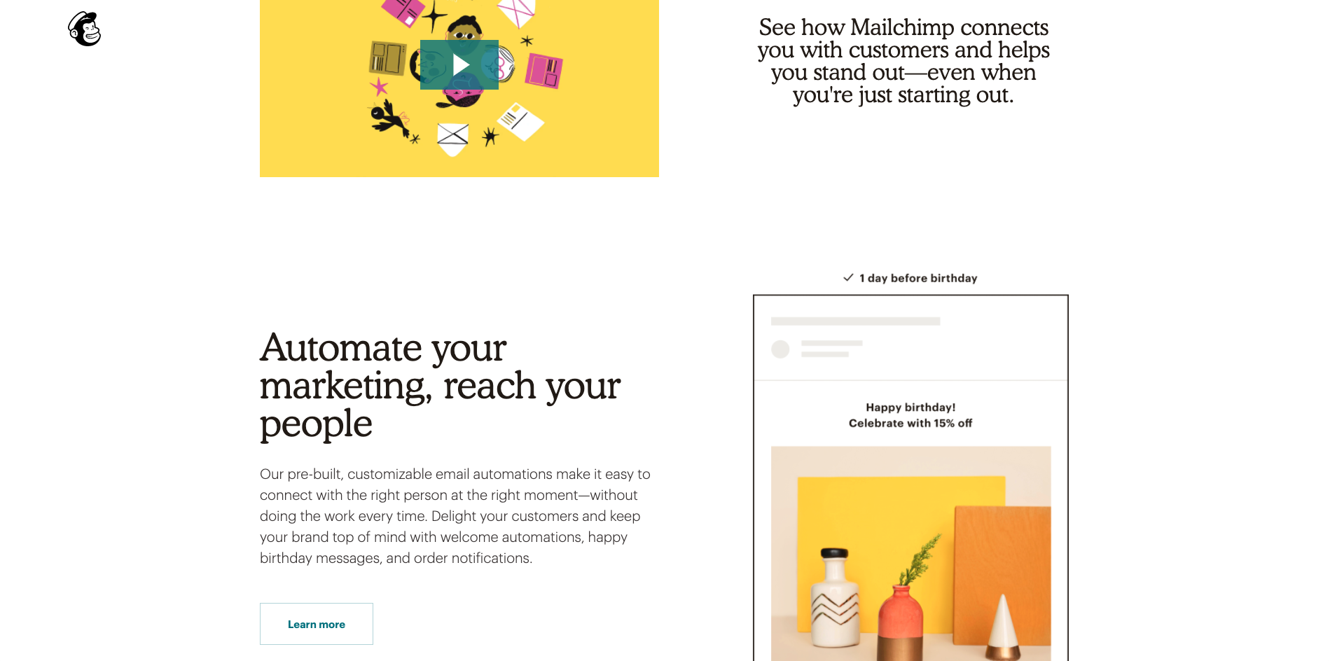
Mailchimp’s homepage displaying a modern take of how to use Cooper Light
I’ve taken note of Mailchimp’s minimalized rebrand and its unique icon illustrations. What I’ve learned that makes it so “brandable” is not just the custom visuals, but the chosen typefaces that really make an impact for the audience as a whole.
Although Mailchimp’s brand was relaunched in 2018, the font they chose – Cooper – is still visually appealing and I’m beginning to see rounded serifs become more popular.
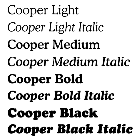
Cooper
Maybe the specific font Cooper isn’t going to be THE font of the year, but I foresee that its characteristics harness the qualities that are going to be sought after.
4 Characteristics of the Cooper Font Family:
Rounded Serif
San-serif fonts have been popular in branding for a number of years now. I believe it’s time for a rounded serif to take the spotlight. People are starting to take notice of successful rounded serif fonts being used in campaigns and I feel more designers will want that type of variety in their pieces.
Aesthetic
Not only does the serif font provide a visual difference, but a retro vibe as well. The curves and bowls in the typeface of Cooper Black provide a sense of a groovy ‘70s feel while that of the Cooper Light can reflect more of a serene, flowerchild vibe. It would even work well as a headline paired with a lighter font weight.
Readability and Accessibility
Since web accessibility is becoming more important than ever, it’s important to be aware of fonts that also work well on the web for readability. The best way to determine this is listing out words like so:

Can you see the difference between the capital I, lowercase l, m, d, and b? How about the letter r and n? Do they look like the letter m?
That means dyslexic readers can distinguish those letters easier than fonts that are not as easily unique. It’s always best to keep these questions in mind while searching for web fonts since there have been lawsuit cases on the rise for not keeping sites ADA compliant.
Pricing
If you have an Adobe Cloud subscription, you can access Cooper Black and Cooper Black Italic for free. However, if you want the other font weights, you will need to purchase them from a font foundry through a font library subscription service such as myfonts.com.
The past couple of years, we saw a trend with sans-serif. And now, we’re starting to see brands bring serifs back into their branding, in a more memorable and overall efficient way.
We love working through branding with clients, and challenging through a memorable and evergreen creation. And sometimes that means stepping away from the popular and into a new design.

