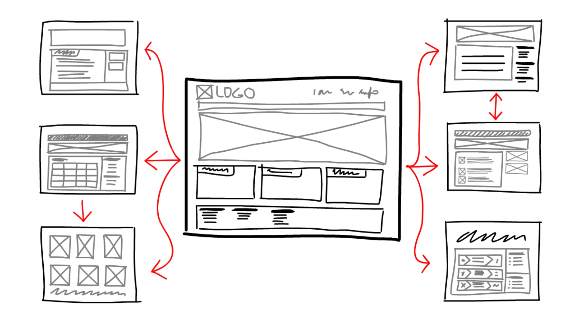
How consumers view content on a webpage is ever-changing. Great web design plays a key part in consuming content efficiently and effectively. Through user-focused design, user experience design, the way content is designed, laid out, placed and viewed on a brand’s website helps consumers identify the most important information and/or helps eyeballs find the information audiences are looking for.
But no website design is the same – nor should it be. The design of a website is intrinsically related to a brand – its products, services, offerings and, most importantly, its consumers.
Audience intelligence, or simply just overall knowledge about a brand’s consumers and what they are looking for when they visit a website, should lead everything with a brand. From marketing to social media to a website, that knowledge about a brand’s audience will ultimately guide website content.
That said, there are a few items that every website should have in order to help guide consumers eyeballs through a website. Here are some key items a website should have to help consumers on their digital journey:
An Efficient Homepage
A homepage is like a business card – it gives off your brand’s first impression. It should have three important pieces of information:
- Who you are
- What you do
- A call to action.
Each section of a homepage should work together toward a common goal or objective – this could mean navigating a user somewhere else on the same website or pointing them to a form to sign up for a services consultation.
Clear, Optimized Navigation
Essentially, the navigation exists to make user’s decisions for them. A clean navigation bar is one of the first places your site visitors may use to get themselves started on their website journey. Having a simple and easy to understand copy to guide them through your site is imperative for that user path.
And good rule of thumb: If you have more than six pages, consider grouping these items into sections and implement drop down menus to help users make their next click easier. Any more than six choices can become overwhelming to the user.
Assign Each Page a Clear CTA
Establishing a call to action on each page is imperative. CTAs create opportunities for engagement.
Examples: A contact form for more information or a form to sign up for a consultation call. It could also be some simple wording or a click through that invites a user to the next logical step on their site journey. For example, if a user is looking for previous clients, a CTA on your homepage could point them to your portfolio page.
Contact Page and Form Areas
A contact lets users get in touch with you!
Additionally, a contact page should include all key contact info (office location, phone number, general inquiry emails, etc.)
Use Visual Hierarchy to Help Distinguish Important Content
When we look at any piece of content, whether it’s in print or online, our eyes are inherently drawn to visuals that stand out. Subconsciously, a user’s brain will rank graphic elements by importance using poignant visual cues. Using this visual hierarchy will help important information pop to your users so they’re guided through a journey on your site.
Because people want the important information first, we’ve become a generation of skimmers. Implementing consistent things like bold typography, infographics, icons, thoughtful photography and other key brand elements will help the content you want to be seen be put at the forefront.
There are many different ways to design and organize the UX of a website efficiently. In the end, you’ll want every piece of your website to be goal oriented and functional to aid in the user decision making journey.


