
Laptops and desktops are still the most popular devices for connecting to the internet, but smartphones are steadily climbing the ranks. Most web traffic now comes from mobile devices, and even Google, the world’s leading online search engine, has transitioned to prioritizing mobile-first indexing. This shift toward mobile-first design is forcing major changes to every marketing strategy because it ignites the need for a mobile-first website.
We know you’re rockstars at desktop web development, but brands looking to stay competitive can no longer back-burner their mobile pages. It’s time to turn your attention toward your mobile-first strategy: Speed up those smartphone page-load rates, decrease bounces, and keep your customers happy and coming back for more with Leap’s mobile-first website tips below.
Why Mobile-First Design Is No Longer Optional

Even more significantly, Statista notes that “even though the United States is not a mobile-centric market…, the number of mobile internet users in the United States continues on a slow but constant upward trajectory and is forecast to surpass 300 million in 2024.” Mobile-first indexing has increased the importance of mobile site speed, and here’s a closer look at how.
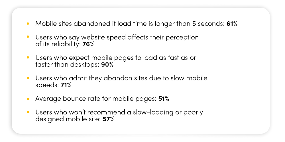
Must-Know 2025 Website Speed Statistics
Desktop SEO is still relevant and shouldn’t be ignored, but the speed, interactivity, and visual stability on your mobile site make a much larger impact. Websites that aren’t optimized for mobile users risk frustrating their visitors, increasing bounce rates, and losing swaths of potential customers.
Gearing Up for a Mobile-First Strategy
It’s widely known that poor mobile UX reduces user engagement – ever abandon a purchase on your smartphone because the mobile checkout process was too difficult? – and it becomes all too clear that mobile-first design is key to creating a seamless experience tailored for mobile users.

So, let’s boilerplate this mobile-first process: What steps are essential to building a great mobile-first website, which elements take priority, and how can the mobile user experience be simplified to accommodate every member of your audience?
- Prioritize Page Speed
Today’s shoppers crave quick turnarounds. Roughly 71% of consumers admit to abandoning mobile sites because of slow, frustrating page load times, but all is not lost. Responsive web design can improve mobile loading speeds by up to 30%, and recent Deloitte studies show that conversion rates on mobile sites increase by 27% with load times of 2.5 seconds or less.
You can take four simple steps to increase your brand’s load speeds, including optimizing images to WebP format to reduce file size, lessening HTTP requests, using lazy loading to delay the loading of offscreen images, and minimizing CSS, JavaScript, and third-party scripts. Looking for a free tool that can help you analyze and improve your site performance? Check out Google PageSpeed. - Simplify Navigation for Every Generation
While teens and tweens have mastered texting, many older-generation consumers need help navigating their smartphones, reading small-screen content, or tackling scroll-heavy pages. Because mobile sites are based on touchscreen actions, integrating large buttons, easy-to-tap menu options, and good spacing between list items is all critical if you don’t want to alienate a large portion of your target demographic.
To streamline your mobile-first website and create the best possible user experience, you can try tactics like these: simplify your mobile menu options, limit pop-ups, and ensure that any CTA and conversion buttons are easily accessible and frequently offered, especially on long pages with dense content. - Don’t Neglect Small-Screen Readability
Again, younger users may have no trouble with small typefaces and poorly structured page menus, but to meet the needs of every shopper, (spark) recommends using a minimum of 16px scalable fonts coupled with high-contrast colors. These visual cues help ensure that every reader can fully navigate and digest your compelling content.
You’ll also want to test your mobile-first website layouts in dark mode as an increasing number of users prefer its calmer tones. Limit large blocks of text that take up entire mobile screens, use bullet points when possible for quick and easy scanning, and leverage bold images and graphics to help break up long pages and direct attention. - Optimize for Google’s Mobile-First Indexing
We’ve said it before but here we go again: Google now prioritizes mobile content over desktop when crawling and ranking sites, so the fastest way to maximize your organic and paid SEO is to make sure your mobile and desktop content matches. Naturally, you’ll want to condense your mobile site, but this doesn’t mean deleting desktop items just to save space. Instead, sort less-critical information into folders or tabs for easy access.
Use structured data and mobile-friendly fonts for readability and avoid Flash and other outdated plugins that won’t work on mobile devices. Consider implementing responsive mobile design to ensure your site can adapt to multiple smartphone and tablet screen sizes. You might even build and develop your mobile website first, then scale up laptop and desktop screens.
Reducing Friction with Mobile-Friendly Forms + Checkout
Remember how many consumers abandoned their purchases because the process was too difficult to complete on their phones? In addition to reducing page-load speeds, simplifying mobile navigation, prioritizing small-screen readability, and optimizing for Google’s mobile-first indexing, the experts at (spark) recommend keeping form fields as short as possible (think first name and email address).
Another friction-reducing option is to build your mobile site with autofill and mobile-friendly keyboards. Offering shoppers a numeric keyboard makes it so much simpler for them to enter credit card information, phone numbers, and shipping addresses. You could also enable one-click payment options like Apple Pay or Google Pay for an even quicker, more seamless UX.

Driving Conversions + Growth with Your New Mobile-First Strategy
Mobile-first website design revolves around creating an intuitive, fast, and conversion-optimized experience for users on every device. By prioritizing speed, touch-friendly design, readability, and seamless navigation, brands can boost their SEO rankings, user engagement levels, and bottom lines. Don’t miss out on the future of mobile-first strategy: Reach out to Leap today to learn more about our user-first designs and see how our data-driven, time-tested methods can optimize your mobile site and start driving faster growth.